The jig is up for Calibri.
Microsoft has just come out with a v v v important piece of news: Calibri is on the outs. No, the font isn’t going to be deleted from your computers, but it won’t be the default font anymore. The company’s design team broke the news on their website, along with the possible fonts that could replace it as the new default.
We need to talk. What should our next default font be? pic.twitter.com/fV9thfdAr4
— Microsoft (@Microsoft) April 28, 2021
“While default fonts may not have the same flair as some of their more eye-catching cousins (we’re looking at you, Bauhaus 93 and Showcard Gothic), they communicate a distinct personality in their own quiet way—a personality that by extension becomes our personality as well. A default font is often the first impression we make; it’s the visual identity we present to other people via our resumes, documents, or emails. And just as people and the world around us age and grow, so too should our modes of expression,” the Microsoft design team said in their official statement.
“Calibri has been the default font for all things Microsoft since 2007, when it stepped in to replace Times New Roman across Microsoft Office,” they added.
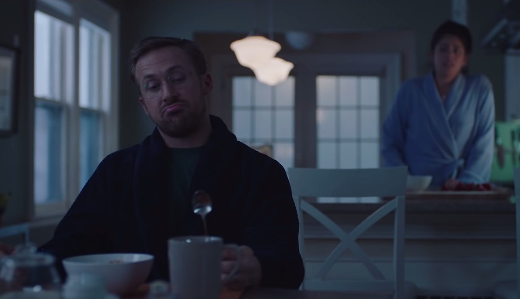
Do you remember that one “Saturday Night Live” skit where Ryan Gosling obsesses over Papyrus? That’s kind of how I feel about Calibri. Not because a mega-blockbuster basically used that font in its entirety as a logo (I can’t think of any Calibri movie logos off the top of my head), but because it’s everywhere. If you’ve ever had to sift through paperwork or at least go through tons of texts, you’d be surprised at how so many of these use the relatively new typeface. It’s not like Cooper Black where at least its ubiquitousness is because it’s a relatively sexy and playful design. Calibri is just…Calibri, you know? People just use it because it’s the first one to show up and they don’t want to think about choosing a different font. Unlike Times New Roman, which still retained its allure even after it was dethroned as the default font, I don’t think we’ll be seeing much use of Calibri after this, TBH.
There are five new fonts that could potentially be the new default font, and I’m excited about the prospects. There’s Tenorite by designers Erin McLaughlin and Wei Huang, Bierstadt by Steve Matteson, Skeena by John Hudson and Paul Hanslow, Seaford by Tobias Frere-Jones, Nina Stössinger and Fred Shallcrass and Grandview by Aaron Bell. Personally, I’m betting on Bierstadt, a typeface that’s influenced by mid-20th-century Swiss typography, and Skeena, a contemporary humanist typeface.
“Microsoft already has Arial—which has many attributes from grotesque types preceding Helvetica—and my approach was to design a sans serif which would contrast with Arial by being far more mechanical and rationalized. The terminal endings are precisely sheared at 90 degrees—a modern note contrasting the softer, angled endings in Arial—and a lack of somewhat fussy curves found in Arial’s ‘a’, ‘f’, ‘y’ and ‘r,’” Matteson said about his design.
If you want to know more about the new fonts, you can check out Microsoft’s page. You can also chime in on Microsoft’s socials to vote for your pick.
Photo screengrabbed from the “SNL” Papyrus skit
Follow Preen on Facebook, Instagram, Twitter, YouTube and Viber
Related Stories:
Connect, BTS is the new font that BTS is gifting us for free
These Filipino illustrators launched a font with native flora for a cause
The iOS 14.5 update stops apps from tracking you, finally
Over 140 Zuckerburg-funded scientists urge Facebook to take a stand against misinformation


